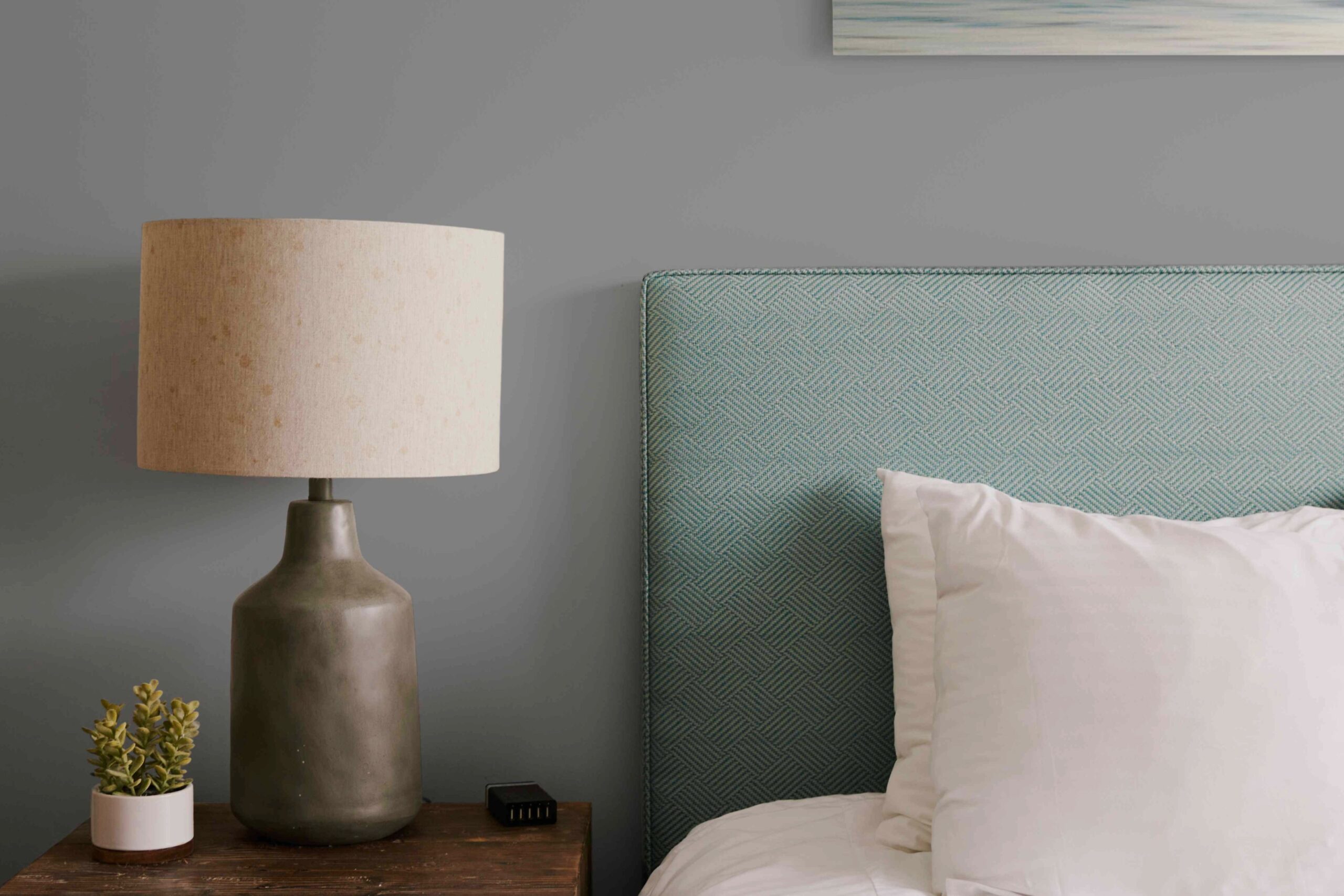
Gray is safe. That’s what everyone says.
It’s the beige of the 21st century. The neutral everyone reaches for when they’re scared of commitment. But here’s the thing: gray is rarely one-note. It isn’t depressing. It doesn’t have to look like a hospital waiting room.
Done right, it’s moody. Soft. Tranquil.
You want a bedroom that feels like a hug? Gray can do that. You want a space that feels like a high-end boutique hotel? Gray does that too. The secret isn’t the color itself. It’s the undertone.
Lighting changes everything. Natural light shifts the hue. Hardware changes the vibe. Floors matter more than you think.
If you’re staring at a chip deck feeling overwhelmed, stop. Read this. Then pick a paint.
How to Pick the Right Gray Undertone for Your Room
Choosing a gray paint color for bedrooms isn’t about guessing. It’s about observation.
Look at your room. Really look.
Is it dark? Does it face north? Then you need warmth. A cool gray in a dark room looks dead. Lifeless.
Is it bright? South-facing? Flooded with sun? A cool gray will pop. It will feel crisp. Clean. Modern.
Check your floors. Are they cool-toned hardwood? Go cool gray. Are they warm oak? Go warm gray or greige.
Look at your hardware. Brass? Warm. Silver? Cool. Let the room tell you what it needs. Don’t fight the light. Work with it.
The Best Warm and Greige Tones for Cozy Spaces
Sherwin-Williams Repose Gray
This is the antidote to “cold.” It’s a warm light gray. There’s a whisper of yellow in there. It feels lived-in. Cozy.
It works best in rooms with average light. Pair it with deep reds or mustard yellows. Don’t go stark white. It looks better with cream or off-white trim. Hang vibrant art here. Let the art set the tone. The wall just holds the frame.
Sherwin-Williams Agreeable Gray
It’s called Agreeable Gray for a reason. It plays nice. It’s warm, but not yellow. It’s brown-adjacent, but not beige.
It’s Sherwin-Williams’ best-seller for a reason. It’s neutral in almost any space. Not too dark. Not too light. It has a beige undertone that makes it easy to decorate. If you want a fail-safe gray that won’t fight you, this is it.
Farrow & Ball Pavilion Gray
Technically a greige. More beige than gray? Maybe. It’s a medium cool tone, though. Hints of blue show up when the light hits it right.
It’s contemporary. Modern. If you’re doing a sleek bedroom design, this fits. It pairs well with other cool hues. It’s light enough to feel neutral but distinct enough to be interesting.
The Best Cool and Blue-Gray Shades for Modern Vibes
Benjamin Moore Thundercloud Gray
Designers love this one. Why? It’s universally beautiful. It’s a cool, lighter gray. It doesn’t lean too green. It doesn’t lean too pink. It’s just… gray.
A great choice if you want modern elegance. Pair it with crisp white. It feels airy. Expensive, in a quiet way.
Benjamin Moore Wolf Gray
Moody. That’s the word. Strong blue undertones. Casual sophistication.
It works in coastal bedrooms. Nautical themes love it. But it also works in dark, cozy rooms. Pair it with burnt orange. Or muted mustard. Or just white. It adds depth without feeling heavy. It’s dark, but not black.
Benjamin Moore Classic Gray
A chameleon. It looks cool next to blue. Warm next to beige. It’s bright. Light. Fresh.
Use it as a white replacement. If you hate pure white but want the brightness, Classic Gray is the move. It feels crisp with white trim. Timeless.
Benjamin Moore Gray Owl
Crisp. Not murky. It leans blue or green depending on what’s next to it.
Designers use this constantly. It’s balanced. Fresh. Perfect for a monochromatic bedroom. You want walls, bedding, curtains—all different shades of gray? Gray Owl is your base. It’s relaxing. Calming. Just right.
Unique Undertones: Green, Purple, and Dark Grays
Magnolia Chime Gray
Farmhouse friendly. Rustic. Nearly white. But there’s green in it.
Subtle. You have to look for it. That green tint gives it depth. It feels homey. Lived-in. Vintage. It looks amazing on dark wood floors. Pair it with muted colors. Bright whites work too. It’s soft. Inviting.
Sherwin-Williams Sensitive Tint
Unexpected. It’s purple-gray. Like a light lilac that forgot it was supposed to be gray.
Cool. Muted. Adds personality without screaming. Pair it with deeper purples. It creates a regal vibe. It’s modern, but with a twist. If you want color but are scared of commitment, try this.
Benjamin Moore Graytint
Torn between white and gray? Stop.
This is a dark white. Misty. Moody. Tranquil. It creates that hotel atmosphere. The kind of room you never want to leave. It works great in rooms with no natural light. Pair it with white linen. Pure simplicity.
Dutch Boy Ship’s Anchor
Dark. Very dark.
Here’s the myth: dark paint closes a room in. Makes it small.
Wrong.
Ship’s Anchor makes walls disappear. The depth opens the space. It feels endless. Use it on an accent wall if you’re scared. Or do all four walls. It’s cozy. Sizable rooms love it. Small rooms don’t shrink. They just get moody.
Quick Tips for Painting Gray
Priming matters. Oil-based primers cover imperfections better than latex. They make the gray pop.
Don’t skip the primer. It changes the finish. It changes the depth.
Measure your room. Use a calculator. Buy enough. You don’t want to mix new gallons later.
Gray is versatile. It pairs with pink. Red. Green. Blue. White. Almost everything.
The mood is up to you.
Want calming? Go light.
Want dramatic? Go dark.
The right shade exists.
It’s probably right there on the rack.
Just check the lighting. Check the floors. Then pick one.