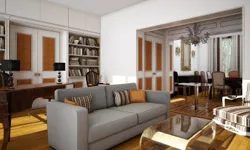
You can have the most beautiful sofa in the world, but if you can’t walk past it without knocking over a lamp, the design has failed. Layout isn’t just about aesthetics. It’s about physics. It’s about whether your morning coffee routine turns into an obstacle course or a smooth glide. Every room has hard limits. The kitchen has the sink and the stove. The bathroom has the toilet and the tub. You can’t move those. What you can move is everything else. The art. The rug. The side table. Getting this right determines if a space feels open and inviting or cramped and chaotic.
Understanding Fixed Elements vs. Movable Furniture
Start by mapping the immovable objects. These are your constraints. In a living room, this might be a fireplace or a large window. In a kitchen, it’s the cabinetry and appliances. Ignore these at your peril. They dictate the skeleton of the room.
Once you know what stays put, look at the open space. This is where the magic happens. You are arranging movable elements to fill the void without blocking the path. The goal is harmony. If you stuff a large sectional into a small living room, you kill the flow. If you leave a kitchen too empty, it feels sterile. You need to find the sweet spot.
Traffic Flow and Sight Lines
Think about how people move through your home. This is traffic flow. You need clear pathways. A common mistake is placing furniture too close to doorways. Don’t do this. Leave at least 36 inches of clearance for a standard walkway. If you want a more spacious feel, aim for 42 to 48 inches. This isn’t just about comfort. It’s about safety. Nobody wants to trip over your ottoman when they’re carrying groceries.
Sight lines matter too. When you walk into a room, what do you see? You should see a focal point. A fireplace. A piece of art. A window view. If you stare at a blank wall or a cluttered corner, the design is working against you. Orient your main seating arrangement toward that focal point. This creates a natural anchor for the room.
Balancing Proportion and Scale
Big rooms demand big furniture. Small rooms need delicate pieces. This seems obvious, but it’s where most DIYers mess up. Bring home a large, heavy coffee table for a tiny apartment, and you’ve shrunk the space visually. The room feels smaller than it is. Conversely, tiny furniture in a massive hall makes the space look empty and disconnected.
Use rugs to define zones. A large rug under a living room set pulls the furniture together. It creates a visual boundary. Without it, chairs and sofas can feel like they’re floating in mid-air. Ensure the rug is large enough so that at least the front legs of your furniture rest on it. This grounds the arrangement.
Testing Your Layout Before Committing
Don’t just guess. Move things around. Use painter’s tape to outline furniture on the floor. This gives you a true sense of scale. You’ll quickly see if a chair blocks the TV or if a bookshelf cuts off the conversation. It’s cheap. It’s fast. And it saves you from buying the wrong size sofa.
Pay attention to how light falls in the room. Natural light changes throughout the
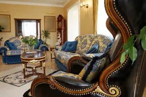
A decent floor plan isn’t just about where the sofa goes. It’s about how bodies—human and animal—move through the air. If you trip over a rug or bang your hip against an island, the layout failed. The standard for clearance isn’t some abstract design theory. It’s the average human frame.
Use this: 42 to 48 inches for main aisles. That’s your baseline. It’s a rule of thumb, not a law.
In a sprawling living room, you might stretch that. Give large spaces a bit of breathing room so they don’t feel boxed in. But in a tight sitting room or small bedroom? Don’t skimp. If you crowd the path to your closet or desk to gain five square feet of floor space, you’re trading convenience for clutter. You’ll lose the ease of use you saved in area.
Traffic Flow and Daily Routines
Start by mapping the traffic. Look at your entrances. Where do people enter? Where do they leave? Then look at the anchors. HVAC controls. Light switches. Power outlets.
These are the friction points.
Place your furniture relative to these nodes. If your couch blocks the path to the main light switch, the layout is wrong. Define the most logical movement patterns first. Let the function dictate the form. Don’t force a chair into a corner if it interrupts the natural flow from the door to the kitchen.
Account for Moving Parts
Static objects are easy to plan for. Dynamic ones are the trap.
Doors swing. Drawers slide. These elements demand space when they’re in use. A door doesn’t just open; it occupies an arc. If you place a bookshelf too close to a swinging door, you’ve just created a traffic jam.
Furniture has movement too. Recliners? They need significant clearance when fully extended. Dining chairs? You need room to pull them out and slide them back in without knocking into the next person’s legs. Anticipate this. Leave functional space for the full range of motion.
The Couch-to-Table Gap
Furniture placement affects flow in subtle ways. Consider the distance between the front edge of your couch and a coffee table or hassock.
18 inches is the minimum. It’s tight. It’s doable for some, but inconvenient for most. You need enough room to walk by without stepping on the table’s edge. You need enough room to pull out a tray without leaning precariously.
Use your best judgment here. Comfort matters. If you’re constantly brushing against the table, increase the gap. Better to have a slightly larger walkway than a cramped, uncomfortable seating area.
Create a Focus
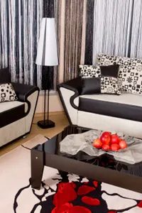
Anchor Your Focal Points
Start by finding the anchor. In a family room, it’s the TV. In a dining area, it’s the view. Or maybe a fireplace. You already know where the eye goes. Use that.
Place furniture to face it. It’s intuitive. But what if your room has no obvious hero? Then you make one. A large piece of wall art. A built-in shelving unit. A desk that demands attention. Pick one thing. Build the rest around it.
Once you have that focal point, group your seating. You need a spot for people to talk. To sit. To not feel like they’re floating in an empty void. Anchor these islands with area rugs. Task lighting helps too. Or a cluster of wall art. In big rooms, this creates cozy pockets. It breaks up the expanse. It makes the space feel lived-in rather than sterile.
Leverage Existing Architecture
Stop fighting the room. Use its bones.
Windows dictate flow. Built-ins offer storage boundaries. Even a weirdly angled wall can work for you. It forces a creative layout. Don’t see a short wall as a problem. See it as a constraint that breeds invention. Position your relaxation zone near a window. Put your work area next to a light fixture. Let the architecture guide the function.
Balance Scale and Proportion
Harmony isn’t magic. It’s proportion.
A large room needs large furniture. A petite loveseat in a cavernous living room looks lost. An oversized sofa in a tiny apartment swallows the space. Pathways matter too. You need enough width to walk through comfortably. Don’t clutter the floor.
The goal is unity. Everything should look like it belongs. If your pieces fit together, they will feel balanced. It’s about scale. Match the room size to the furniture size.
Safety First, Aesthetics Second
If this feels overwhelming, step back.
Room layouts are works in progress. They change with the seasons. They change when you host holidays. They change as your family’s needs shift. But one rule never changes. Keep it safe. Keep it easy to use.
If you can’t walk through the room without stepping over a coffee table, you’ve failed. Function precedes form. Play with the design. Adjust things. If it doesn’t look right, move it. The more you experiment, the more you’ll learn what works for your specific lifestyle.
Try Before You Buy
You don’t need to move heavy furniture to test a layout. Use a virtual design tool.
FloorPlanner BASIC is a free, browser-based option. It lets you sketch your space and drag furniture around without the back-breaking labor. It’s simple. It’s fun. And it saves your back.
Practical Next Steps for Your Renovation
Since you’re likely rolling up your sleeves for this, here is the reality of executing these layouts.
1. Measure Twice, Cut Once
Before moving a single sofa, measure the actual floor space. Include baseboards. Include door swings. A 2-foot pathway might look fine on paper, but if your door opens into it, you’ve got a collision.
2. Rug Sizing is Non-Negotiable
If you are anchoring a seating area with a rug, make sure all front legs of your furniture sit on it. Or better yet, all legs. A rug that’s too small looks like a postage stamp. It fails to define the space.
3. Lighting Layers
You mentioned task lighting earlier. Don’t skip it. Overhead lighting is often too harsh for conversation. Add plug-in sconces or floor lamps near your seating islands. It creates that “cozy” vibe instantly and makes the space functional at night.
4. Test the Flow
Stand in the corners of your room. Look toward the center. Is there a clear path to the focal point? Are you tripping over anything? If yes, shift the furniture. Even an inch makes a difference.
The trick is to keep it simple. Pick a focal point. Anchor it. Balance the scale. Keep the path clear.
And remember, your house is not a museum. It’s a place to live. If a chair is uncomfortable, no amount of perfect proportion will save it. Prioritize comfort. Prioritize safety. The style will follow.
You don’t need to get it perfect on the first try. Just get it started.