
Small kitchens don’t have to feel cramped. Strategic use of color can visually expand even the most compact cooking spaces, making them feel brighter, airier, and more functional. We spoke to three interior designers to uncover their top color recommendations for maximizing the illusion of space in small kitchens – and the reasoning behind their choices.
The Power of Warm Whites
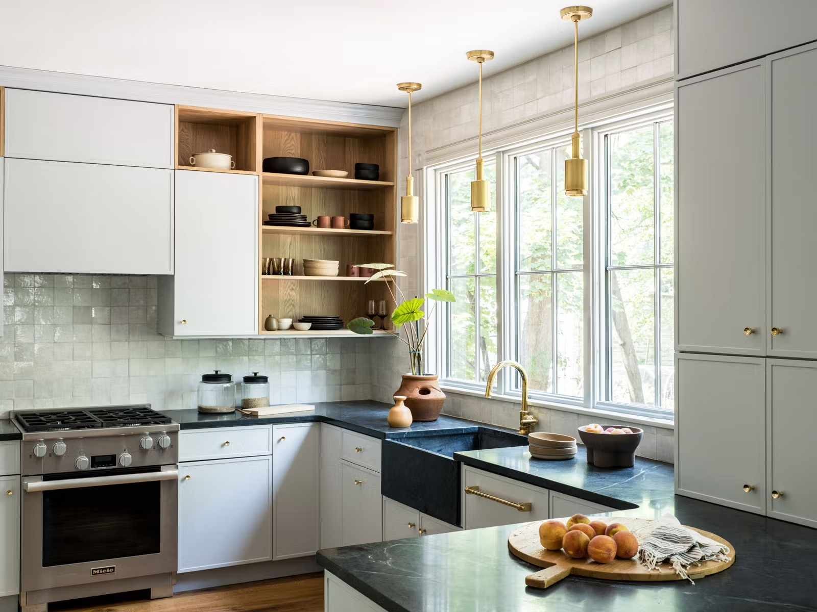
All three designers unanimously agreed: warm, off-white shades are the foundation for a spacious-feeling small kitchen. Designer Jacqueline Gonçalves emphasizes that “a warm white with just a touch of creaminess is perfect for walls and ceilings… It reflects natural light beautifully, helps open up the space, and pairs with virtually any accent color.” This isn’t just preference; warm whites avoid the harsh clinical feel of stark white, which can make small rooms seem smaller.
Muted Greens and Grays: The Art of Receding Color
Beyond white, designers favor muted greens and grays. These shades, particularly those with gray undertones, “recede visually,” as designer Sarah Saab explains. Because they reflect less light, they minimize visual clutter and create a sense of breathability.
Gonçalves suggests using these hues for cabinets, especially when paired with warm whites and natural wood tones. The key is low contrast —avoiding jarring color shifts that chop up the space.
Light to Mid-Tone Blues: Airiness and Contrast
Karen Germond champions light to mid-tone blues for small kitchens. These shades introduce a feeling of airiness, particularly when contrasted with white. “Combining blue and white in kitchens, especially smaller ones, creates a soft and pleasing contrast that doesn’t overwhelm the space,” she notes.
This approach works because blue evokes the sky and water, naturally expanding the perceived boundaries of the room. Pairing blue cabinets with white walls is a particularly effective strategy.
Earthy Neutrals: Mushroom and Putty Tones for Cohesion
For cabinetry in tight spaces, Saab often chooses mushroom or putty tones. Her advice? Avoid high-contrast schemes. “High-contrast kitchens photograph well, but in person, the sharp break between dark and light chops the room to pieces.” Instead, matching cabinet and wall tones with similar light reflectance values creates a seamless flow, tricking the eye into perceiving more volume.
Cool Grays for Wood-Heavy Kitchens
If your small kitchen features stained wood (floors, cabinets), Gonçalves recommends cool-toned grays for the walls. Paired with creamy white trim, this combination complements the wood while maintaining brightness. This approach avoids a cluttered or overly warm aesthetic.
In essence, the key to making a small kitchen feel bigger lies in color choices that maximize light reflection, minimize visual contrast, and create a sense of flow. By opting for warm whites, muted greens, soft blues, or earthy neutrals, you can transform a cramped space into a functional and inviting kitchen.


